Marian Middle School
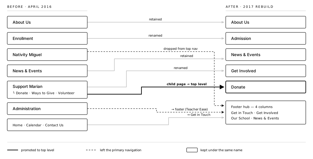
On the old site, a Donate button was the only way to get involved. The redesign put Get Involved beside Donate in the top menu, opening volunteering and events to the wider community, with every key task within two clicks. Nobody tested it with visitors or tracked giving.

One feature, start to finish Get Involved beside Donate, everything within two clicks
- Research some research, not all of it
- Design designed the answer
- Measurement measurement not shown here
Design only. There was no research with families, volunteers or donors, the two-click limit was checked against the site map, and nobody set up analytics after launch.
Read the full study →Context
Why did this work matter?
- C
- A
- R
- D
- I
- O
Marian Middle School is an all-girls, faith-based school in Saint Louis. The old menus followed internal departments, so visitors had to dig, and the only way to get involved was a Donate button. There was nothing for people who wanted to give time or come to an event.
Assumptions
What did we believe going in?
- C
- A
- R
- D
- I
- O
Two beliefs came first, agreed before any design: the community would show up for more than donations, so volunteering and events needed the same top-level place as giving, and every key task should sit within two clicks of any page.
Research
How was it tested?
- C
- A
- R
- D
- I
- O
I audited every page of the old site, asking what each kind of visitor came to do. Nobody interviewed or surveyed visitors.
Intervention
What changed because of it?
- C
- A
- R
- D
- I
- O
Six department-shaped sections became five shaped around visitors: About Us, Admission, News & Events, Get Involved and Donate. Get Involved took the place giving had held alone, right beside Donate, and the homepage gave it one of three big buttons.
Outcome
What was the impact?
- C
- A
- R
- D
- I
- O
Every key task came in within two clicks on paper, not in a visitor test. Website 2.0 launched in 2017 without analytics. Nine years and a redesign later, the Internet Archive shows seven About Us items in their 2017 order.

Also on this project
Read the full study →Three big homepage buttons: Innovative Programs, Get Involved and Enroll Now.
The school's results moved onto the homepage: 96% graduating high school, 84% going on to college.
I built the front end too.