Marian Middle School
Information architecture and website redesign for an all-girls faith-based middle school


My role
Freelance designer
- Client
- Marian Middle School
- Role
- Freelance
- Team
- With Jessica McCarthy, the school's Manager of Philanthropic Gifts
- Years
- 2016 to 2017
- Launched
- 2017
- Audited every page of the old site and rebuilt its information architecture around the people who visit it.
- Designed the homepage, the values pages, the events section and the email sign-up.
- Built the front end, the pages people see in their browser. Also connected the donation page to the school's donor records, working with Jessica McCarthy, the school's Manager of Philanthropic Gifts.
- 9 years the 2017 information architecture has lasted, through one full redesign
- 7 About Us items still in the same order since 2017
- 6→5 top-menu sections, reshaped from school departments around visitors
- ≤ 2 clicks to every key task from any page, checked against the site map before launch
Summary
Marian Middle School is an all-girls, faith-based school in Saint Louis, Missouri. Its old website was organized the way the school was run, department by department, so the families, volunteers and teachers who visited had to dig for the one thing each of them came for.
Website 2.0 launched in 2017, built around those three kinds of visitors, with everything someone came to do one or two clicks away. I did the information architecture and the design, and built the front end. Nobody set up analytics after launch, so this page shows what I built and how I checked it, not what it changed.
Who was involved
- Families Deciding whether to enroll. College-minded families want to see the school's results first.
- Volunteers and donors From the community. On the old site, giving money was the only way in.
- Teachers The school's own staff, the third kind of visitor.
- School stakeholders The staff with a say in the wording, who checked the values pages against the school's brand guide.
Context
The old site's menus followed the school's internal departments, not the way each kind of visitor thinks about Marian. The paths that mattered most were buried: enrolling, signing up to volunteer, coming to an event. Nothing on a page stood out from anything else.
The school's strong results weren't on the site at all, even though college-minded families want to see them first. And the only way to get involved was a Donate button, with nothing for people who wanted to give time or come to an event.
Research
I started with an information architecture audit, the information architecture being how a site's pages and menus are organized, like the floor plan of a building. I went through every page of the old site and asked, for each kind of visitor, what did they actually come here to do? That answer set the structure and everything after it.
Nobody interviewed or surveyed visitors. Most of what the design rested on were beliefs, and the record below says which ones were checked and which were not. The one firm rule, that every key task sit no more than two clicks from any page, was agreed before any design work began.
Each dot is one belief, placed by how much it mattered and how much we actually knew. The top right corner is where being wrong would hurt most and we knew least, so that is where the research went first.
- Held up
- Partly held
- Didn't hold
- Never tested
| ID | Assumption | Certainty | Importance | Status |
|---|---|---|---|---|
| A1 | Families thinking about enrolling and volunteers from the community are the two most important visitors to the homepage. | Medium | Critical | Not testedThis was the designer's judgment, with no audience research and no analytics after launch. |
| A2 | Visitors will find what they came for if every key task is no more than two clicks from any page. | High | High | Partially validatedAn audit of every menu item confirmed the two-click limit before launch, but no visitors were tested; the 2017 structure is still in place nine years on. |
| A3 | Fundraising matters too much to bury in a submenu, so Donate needs its own place in the top menu. | High | High | Not testedDonate moved to the top menu after the kickoff meeting with the development director, and nobody tracked whether giving changed. |
| A4 | Families with college in mind judge a school by its measurable results. | Medium | High | Not testedThe school's results moved from a printed packet for new parents onto the homepage, but no one measured whether families noticed. |
| A5 | The figures in the school's printed packet for new parents were accurate. | High | Medium | Not testedThe numbers were shown with credit to the school, and checking them was outside the design work. |
| A6 | Leading with faith, while respecting each student's own tradition, would not turn away families of other faiths. | Medium | High | Not testedPutting faith first was the designer's suggestion and the school agreed, but it never came from research with families. |
| A7 | Real volunteers and parents shown by name and photo earn more trust than the school's own words. | Medium | Medium | Not testedThe idea was borrowed from common practice at nonprofits, with no research of its own. |
| A8 | A live countdown would bring more people to fundraisers like Girls Night Out. | Medium | Medium | Not testedThe school asked for it because the event had fallen short of its attendance goals; the countdown worked, but attendance was never tracked. |
Design
Six sections shaped like school departments became five shaped around visitors: About Us, Admission, News & Events, Get Involved and Donate. Get Involved took the place giving had held alone: it sits beside Donate at the right end of the top menu, always in view, so volunteering and events reach the same wide audience as giving. What left the main menu, like the calendar and contact links, moved into a new four-column footer.
The homepage shows three big buttons before you scroll, and the school's results moved out of a printed packet for new parents and onto the homepage. The school's five values got one tab each, with faith first. For the community, an events section was built around a live countdown for fundraisers like Girls Night Out, with a one-field email sign-up below it.
One field, one button, one big envelope
The email sign-up asks for one thing: an email address. The form stays small, on the left. The envelope on the right is big and it moves, opening to show a letter, so the ask feels like an invitation instead of a chore.
Rebuilt for this page with the colors, type, field and button the 2017 stylesheet set. The wording is a stand-in, not the original copy, and the form here doesn't send anything.


More screens


A design that didn't work
Teal was the color for things you can click, and the default teal went live at 2.45 to 1 against white. That is too pale to pass the accessibility minimum for link text and button labels. The darker teal, which passes at 5.08 to 1, sat unused except on hover.
The color system was real, but nothing was checking it. Nothing measured contrast, and nothing measured whether spacing stayed on the grid, so small off-grid spacings from the framework crept in too. You can still see both mistakes in the site's style file a decade later. Today I would make the darker teal the resting color and darken it further on hover.
Outcomes
Before launch, I checked every menu item against the site map, and every key task came in within two clicks. That was a check on paper, not a test with visitors. Nobody set up analytics after launch, so I can't say whether more families enrolled or more people gave. The 87%, 96% and 84% are the school's own published numbers; the redesign put them where families could see them, it didn't create them.
The structure did last. Nine years and one full redesign later, the Internet Archive shows seven About Us items still in the same order since 2017.
Three big homepage buttons: Innovative Programs, Get Involved and Enroll Now.
The school's results moved onto the homepage: 96% graduating high school, 84% going on to college.
I built the front end too.
Credit
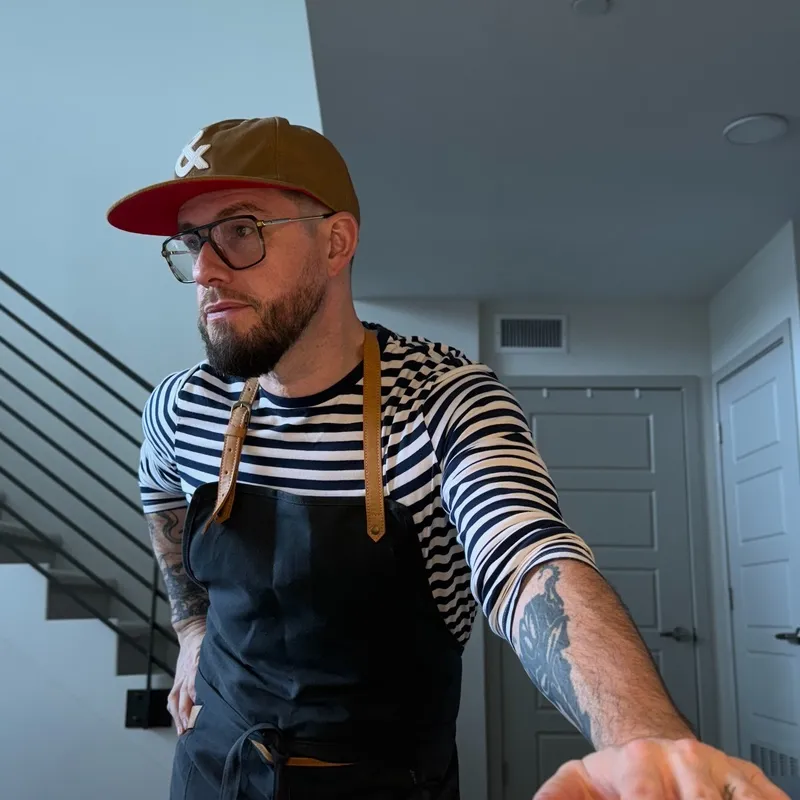
Robert Duebelbeis
Freelance designer
Audited the old site and rebuilt its information architecture, designed the homepage, the values pages, the events section and the email sign-up, built the front end, and wrote the code connecting the donation page to the school's Blackbaud donor records.
-
Manager of Philanthropic Gifts
Worked with Robert on connecting the donation page to the school's donor records.
