A research program for a pulse oximeter app
A 20-week plan for testing a phone app that works with a fingertip oxygen meter, with the people who would depend on it
My role
Lead UX Designer
- Employer
- World Wide Technology
- Client
- A medical device maker
- Years
- December 2020 to February 2021
- Status
- Proposed, not run
- Planned a 20-week human factors and usability research program for a medical device maker's pulse oximeter app, as part of World Wide Technology's proposal to build it.
- Wrote the human factors and usability pages of World Wide Technology's December 2020 proposal: the panel, the quotas and the three session styles.
- Wrote the participant criteria and screener, from draft 1.0 on January 22, 2021 to draft 3.0 in early February.
- Set the quotas: two diseases, two phone systems, men and women in equal numbers, as ranges that still hold the mix with 60 people.
- Built the testing schedule, from short remote rounds with clickable prototypes to hour-long sessions with the app and the oximeter.
- 20 weeks of testing planned, from clickable prototypes to the oximeter in people's hands
- 80 people living with COPD or pulmonary fibrosis to recruit, to keep at least 60
- 13 remote sessions: 10 short rounds, then 3 one-hour sessions with the app and the oximeter
- Not measured the program was proposed and did not run
Summary
A medical device maker was developing a fingertip pulse oximeter, the clip that reads the oxygen in your blood, and a phone app to go with it. The people it was for live with lung disease and check their oxygen often. An app like that is easy to test with the wrong people, and the proposal planned to take it to the FDA later, so the testing had to stand up to a reviewer.
I planned the research: who would take part, how the screener would turn away people who could bias the results, and the order of testing over 20 weeks. The program was proposed and did not run, so nothing in it was measured. What's here is the design.
Who was involved
- People living with COPD or pulmonary fibrosis The panel the program would have recruited: adults who check their blood oxygen at least every other day.
- The medical device maker The client, making the oximeter and planning the app.
- World Wide Technology's proposal team Planned the app with device, mobile and cloud workstreams, and a UX team to design and test it.
The product
A pulse oximeter clips onto a fingertip and reads how much oxygen your blood is carrying, a number called SpO2. This one was a consumer device, made to work with an app on the user's own phone, iPhone or Android. In December 2020, World Wide Technology proposed to design and build the app with the device maker, and I wrote the proposal's pages on the research to test it.
The proposal planned the app in two phases. The first was a general wellness product, under the FDA's policy for low-risk products that support a healthy lifestyle. The second would take the app to the FDA for clearance as a medical device, a 510(k) premarket submission. So the proposal had every round of testing written up in the design history file, the record a reviewer reads, from the start.
Two months earlier, I had written the Human Factors skill area for World Wide Technology's UX career ladder. This was the program where I planned that work for a medical device.
Who would take part
A usability test is only as good as the people in it. The app was for people living with lung disease, so the panel had to be them. The criteria named two diseases, pulmonary fibrosis and COPD (chronic obstructive pulmonary disease), each diagnosed more than six months before.
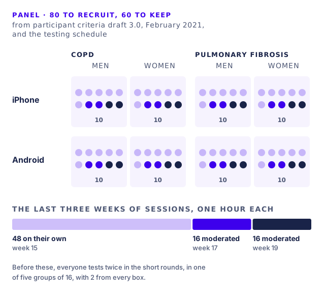
Draft 3.0 asks for 80 people to keep at least 60 over 20 weeks. Each disease gets 30 to 40, each half on iPhone and half on Android, and each of those half men and half women. The ranges leave room for people to drop out: the low ends add up to 60.
Everyone had to measure their blood oxygen with an oximeter at least every other day, use the internet on their phone at least monthly, already use a health app, see a doctor at least once a year, read and speak English, and be 18 or older. The screener also asked for a mix of ages and races.
Who the screener turned away
Some people know too much about a product like this to test it fairly. The screener turns away anyone who works, or has someone in their household who works, in health insurance, as a physician or nurse, for a healthcare device maker, in market research, or in website or app design or development. It also turns away the self-employed in those fields, and anyone who sat on a health research panel in the last six months.
The last question asks people to rate seven oximeter makers from 1 to 5. Anyone who rates the client a 1 or a 2 is screened out, since a tester who dislikes the brand before starting could color every answer about its app.
Twenty weeks, staged by fidelity
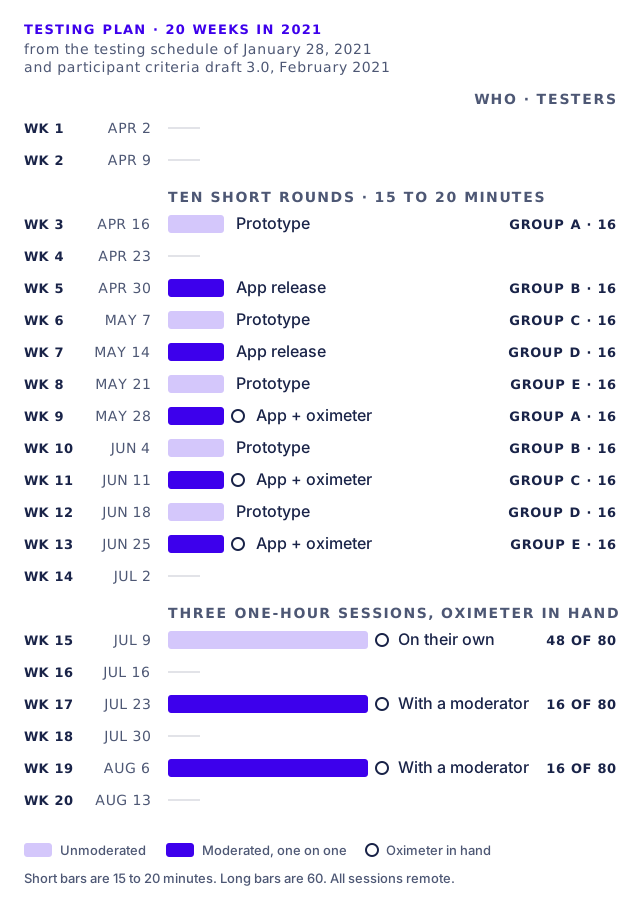
Fidelity is how close a test is to the finished thing. The schedule starts low and climbs. Weeks 3 to 13 hold ten short remote rounds of 15 to 20 minutes. The unmoderated ones, where people test on their own, use clickable prototypes to check our human factors design assumptions. The moderated ones, one on one with a researcher, use the latest app release, and from week 9 the oximeter too.
Then come three one-hour sessions with the app and the oximeter together, end to end: 48 people on their own in week 15, then 16 with a moderator in week 17 and 16 more in week 19. That is all 80, the formal study of the app at the end.
We split the panel into five groups of 16, with 2 from every box of the grid, and the groups take turns, each coming back for a second short round five or six weeks after its first. So no round's testers would have seen the round just before it. After each round, the proposal had the UX team bring its findings to the product owners and update the design history file.
What changed between drafts
The December 2020 proposal named asthma and COPD, 40 people each, ages 18 to 65. By draft 1.0 in January, pulmonary fibrosis had replaced asthma, and the age cap came off: adults of any age, with a mix asked for.
From draft 1.0 to draft 3.0, ten days later, the plan grew from 16 weeks to 20. The short rounds went from six of each kind with 3 to 5 people to five of each kind with up to 16. The bar for taking part rose from measuring blood oxygen weekly to at least every other day. The oldest iOS and Android versions allowed went back about three years, from iOS 14 to iOS 11 and from Android 10 or 11 to Android 7 or 8. The fixed quotas of 40, 20 and 10 became ranges. And the healthcare exclusion narrowed from anyone in a provider's office, billing included, to physicians and nurses.
Outcomes
The program was proposed and did not run. There are no findings, and nothing in it was measured.
What the files show is the design. The panel is split into eight equal boxes and sized to survive dropouts, so a reviewer could check it box by box. The screener names whom it turns away. And the schedule doesn't put the app in front of the panel for the formal study until people have tested it with the oximeter in hand.